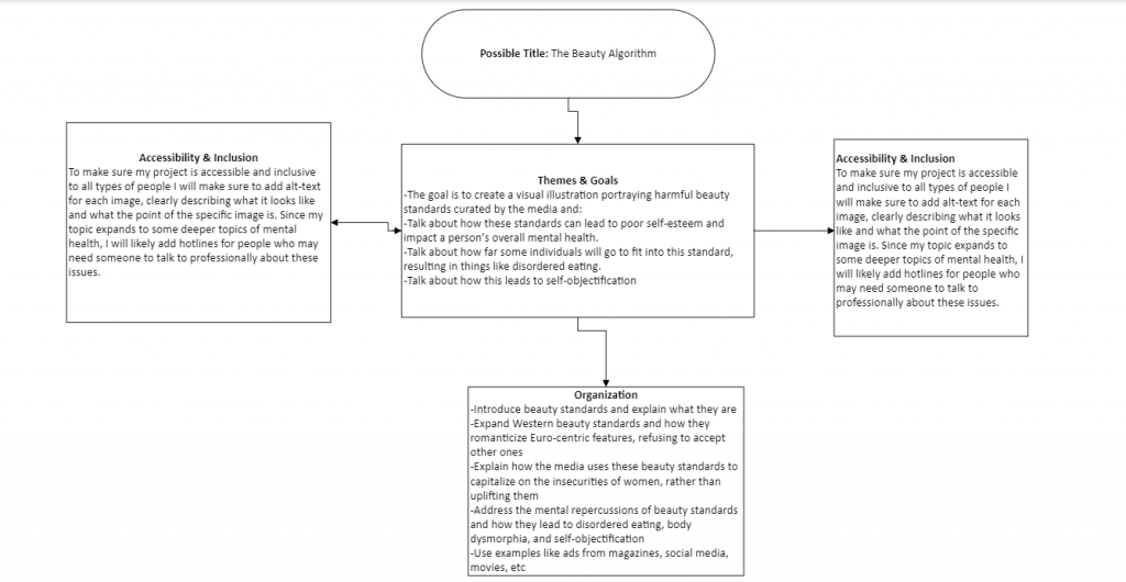
This is my storyboard for my final, which is going to be an art piece representing Western beauty standards and the harm it can have on mental health. I also plan on talking about how the media curates these standards, capitalizing on the insecurities of women instead of trying to uplift them. Following this, I want to try to add a time-lapse of the piece being drawn via Procreate.

This is a solid story board. I like the fact that it’s simple and easy to see the bigger picture. You have included the theme, goal structure and accessibility which is great.
You did a great job with organizing your story board, making it easy to read and understand what your project is going to be about. You also made sure to add different ways of accessibility and inclusion for all types of people to view your project. The only thing I would say is adding specific readings that tie your work to our class discussions. Great work!
I like the idea, but it seems like you opt and pasted the same text into two different boxes. This may confuse you in the future.
This storyboard is simple and very easy to “navigate”; it’s also pretty unique because I noticed that you will add a hotline for people who need to talk to a professional about such issues. That’s very thoughtful!
In this storyboard, I believe that it is reaching full point on most of the criteria. The organization of your thoughts are clear, there is evidence of strong planning while all of the elements are fitting together. To improve you could add what your specific target audience is for your project, and what there identities are. Overall your storyboard works very well, good job!
Hi! I loved your topic and theme! It is definitely one of the topics I’m really passionate about as someone who is into self-development and self-love. I can’t wait to see your final project. Your organization looks great as well. That said, though your accessibility and inclusive statement are great, particularly with your plan to include alt-text and add hotlines for people who might need them, I would suggest adding a navigation bar at the top to make it more accessible for users. Lastly, I think you’re missing your audience; while people could definitely tell by your theme and goal, clearly defining who the project is specifically aimed at would be helpful. Overall, good job:)
I think that this storyboard reaches and goes above and beyond when trying to meet the criteria. I do not have any suggestions besides explaining who the target audience is a little bit more.